Rawnice : Visual Identity & Packaging Design
CLIENT : Rawnice
CATEGORY : Branding + Packaging Design
DATE : 2018 – 2021
OTHER RAWNICE WORK : Explore the range of illustration work I created for the Rawnice rebrand or the recipe book I designed.
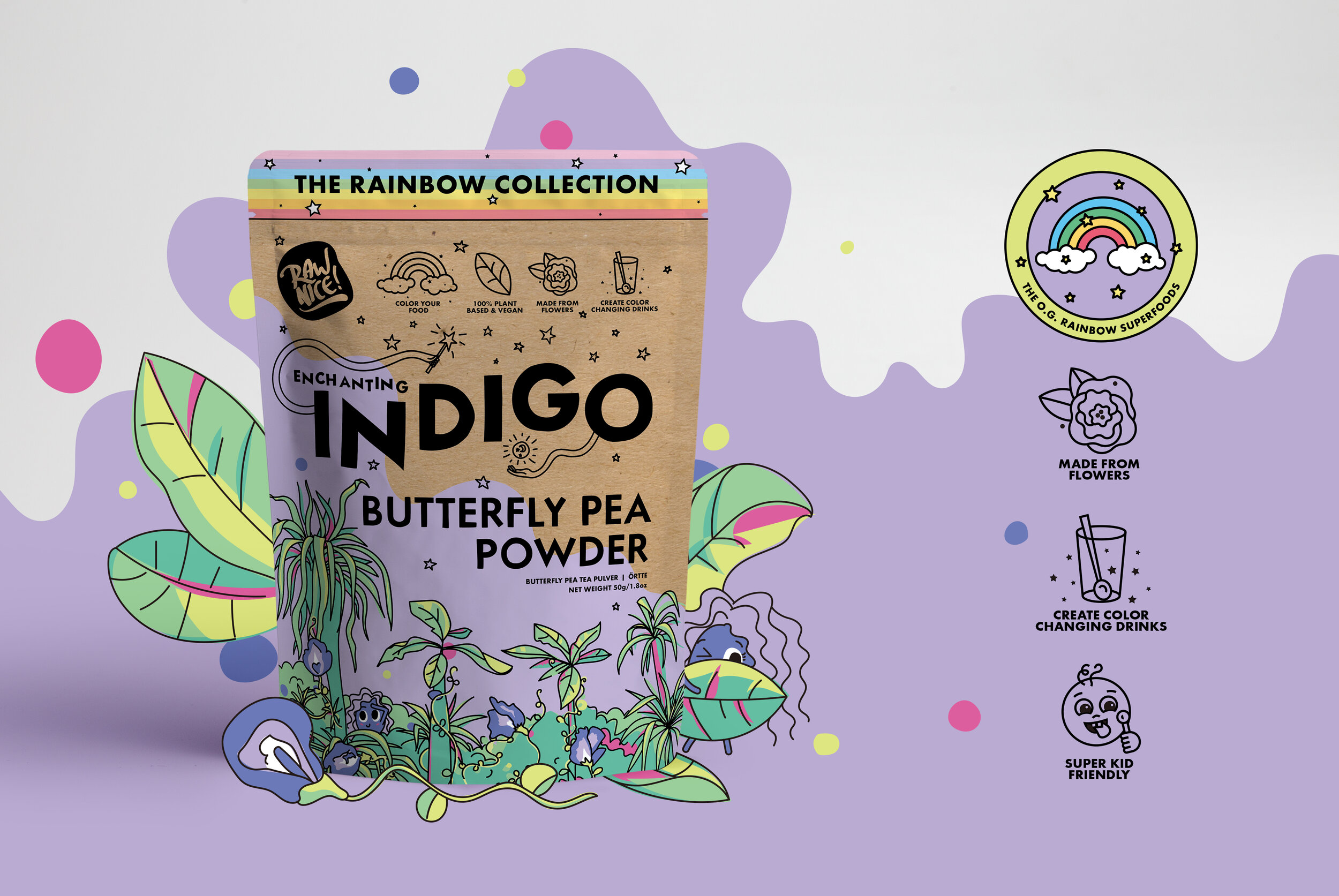
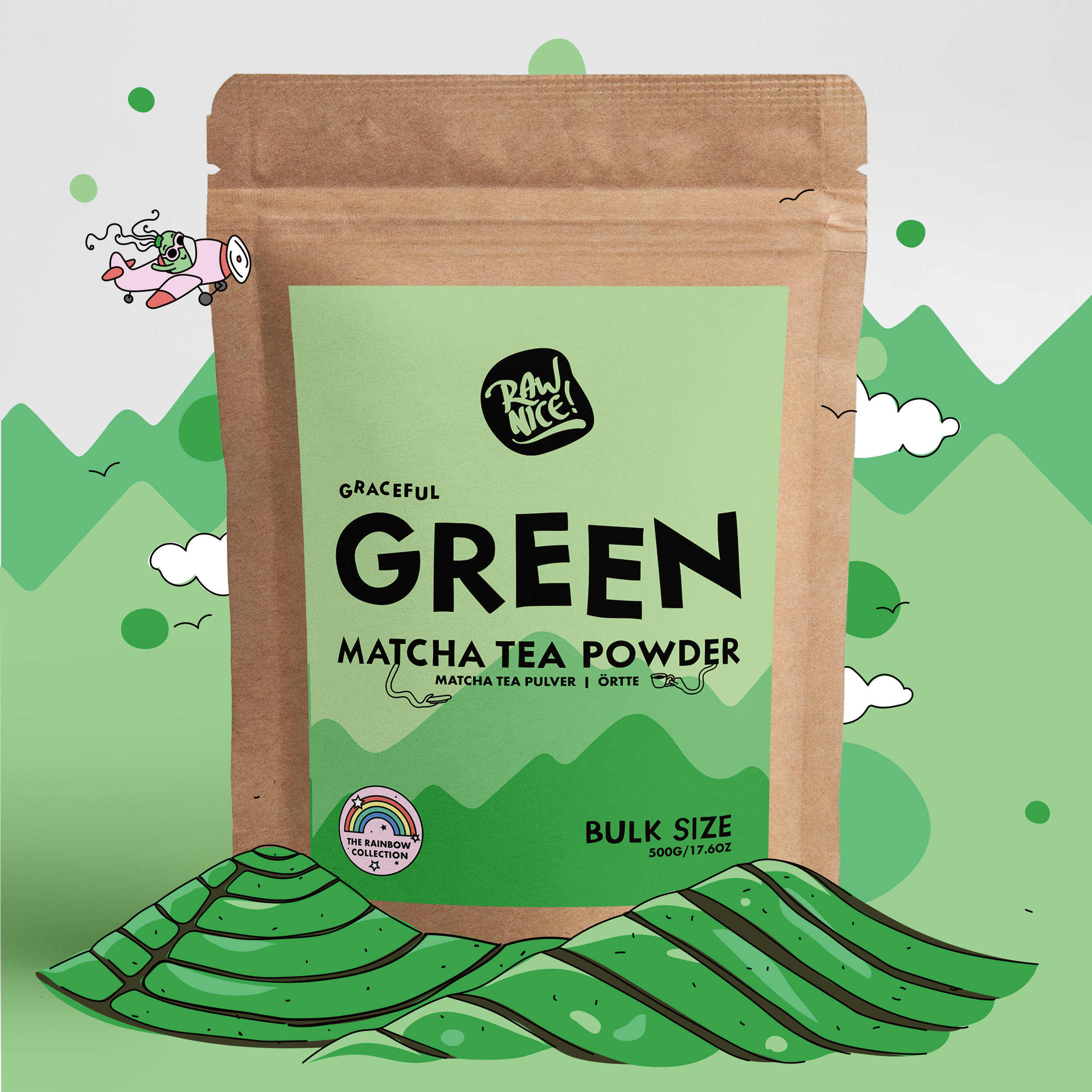
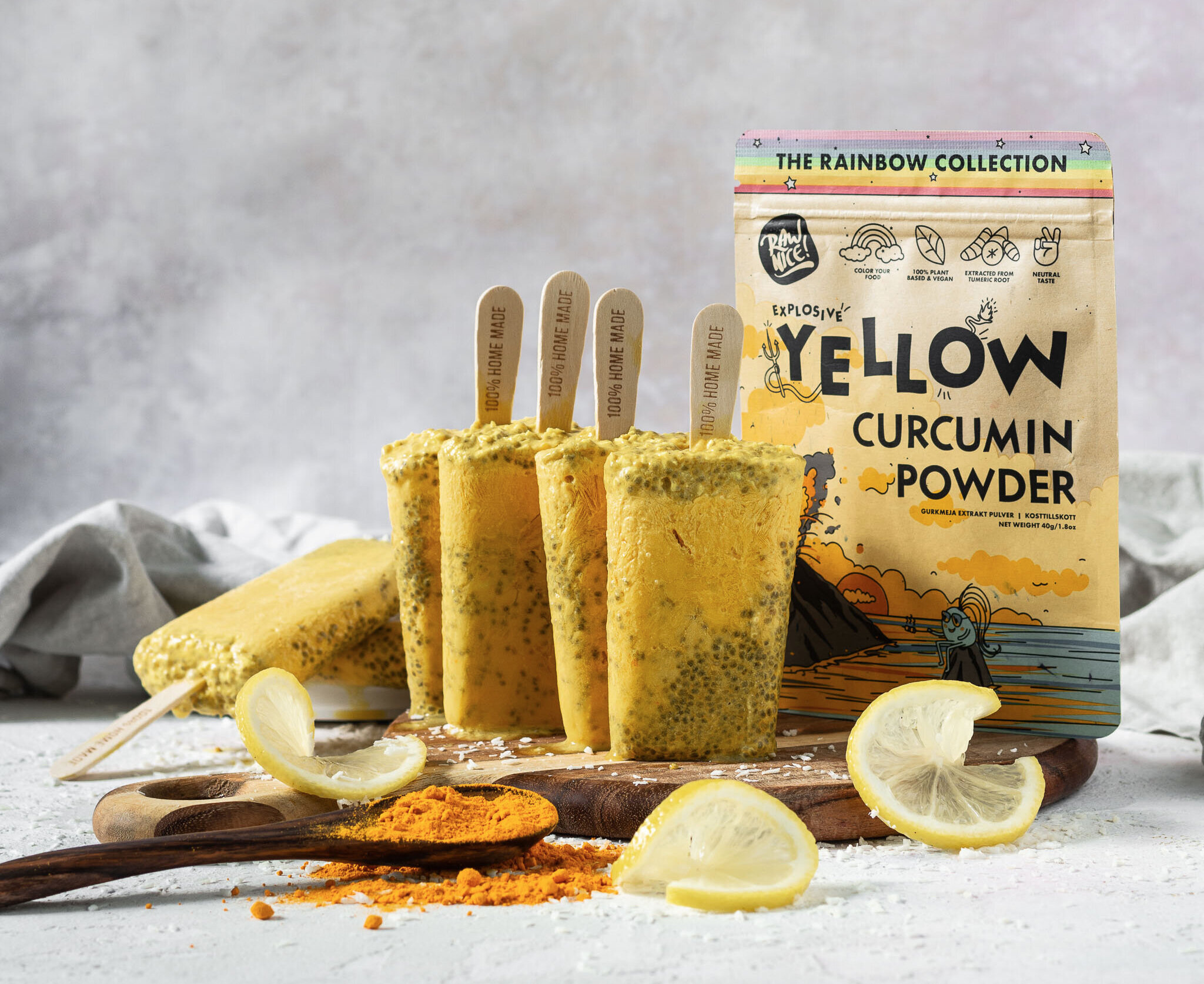
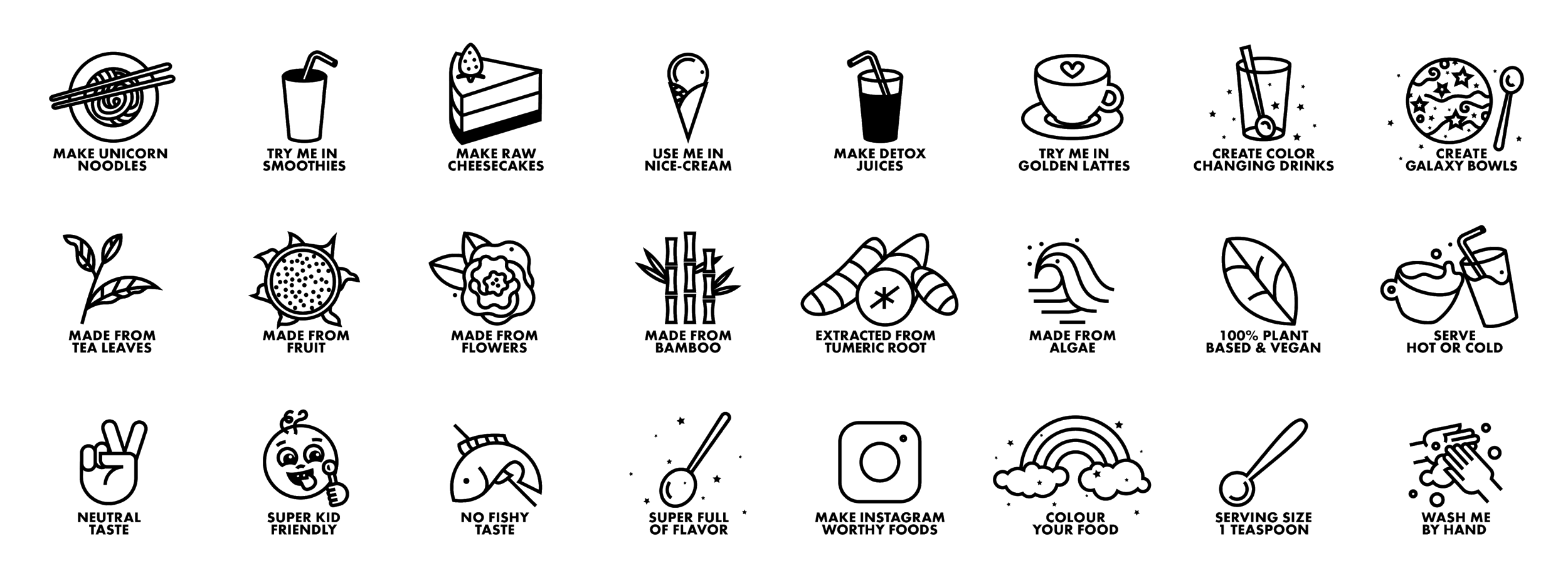
Already a well established brand in the rainbow ‘superfoods’ industry, Rawnice came to the table wanting a fix for their visual identity not expressing their personality. They wanted to portray their sense of fun, and their sass with branding that felt playful and a little rebellious, but still appeal to their wide range of customers. We created a drastically new visual direction, a character to use across all their products and content, illustrations, icons, custom typography, advertising content, and a full new set of packaging for their superfood powders in retail, bulk and sample sizes. As an ecommerce brand with a growing customer base Rawnice is constantly working on new products and campaigns. After the re–brand I’ve stayed on to run the design on these projects.
The visual direction was inspired by Rawnice founders Jesper & Helene’s love of cartoons. Inhabiting an adventure filled world in a colour palette of pastels with pops of vibrant hues, Rebel shows up across the variety of brand content and really ties everything together. The character was born to illustrate and help Rawnice communicate the things that really matter to them. Just like us humans she take form in different shapes and sizes, and she will never give a fuck about what anyone else thinks about her.
