Wai Water
CLIENT : Healthy Futures
CATEGORY : Identity Design/Branding
DATE : 2017
FROM THE CLIENT :
Oh my gosh this is absolutely amazing. You have done an incredible job, I am absolutely thrilled with this. It is really really beautiful. Thank you so very much Sam for all of your hard work.
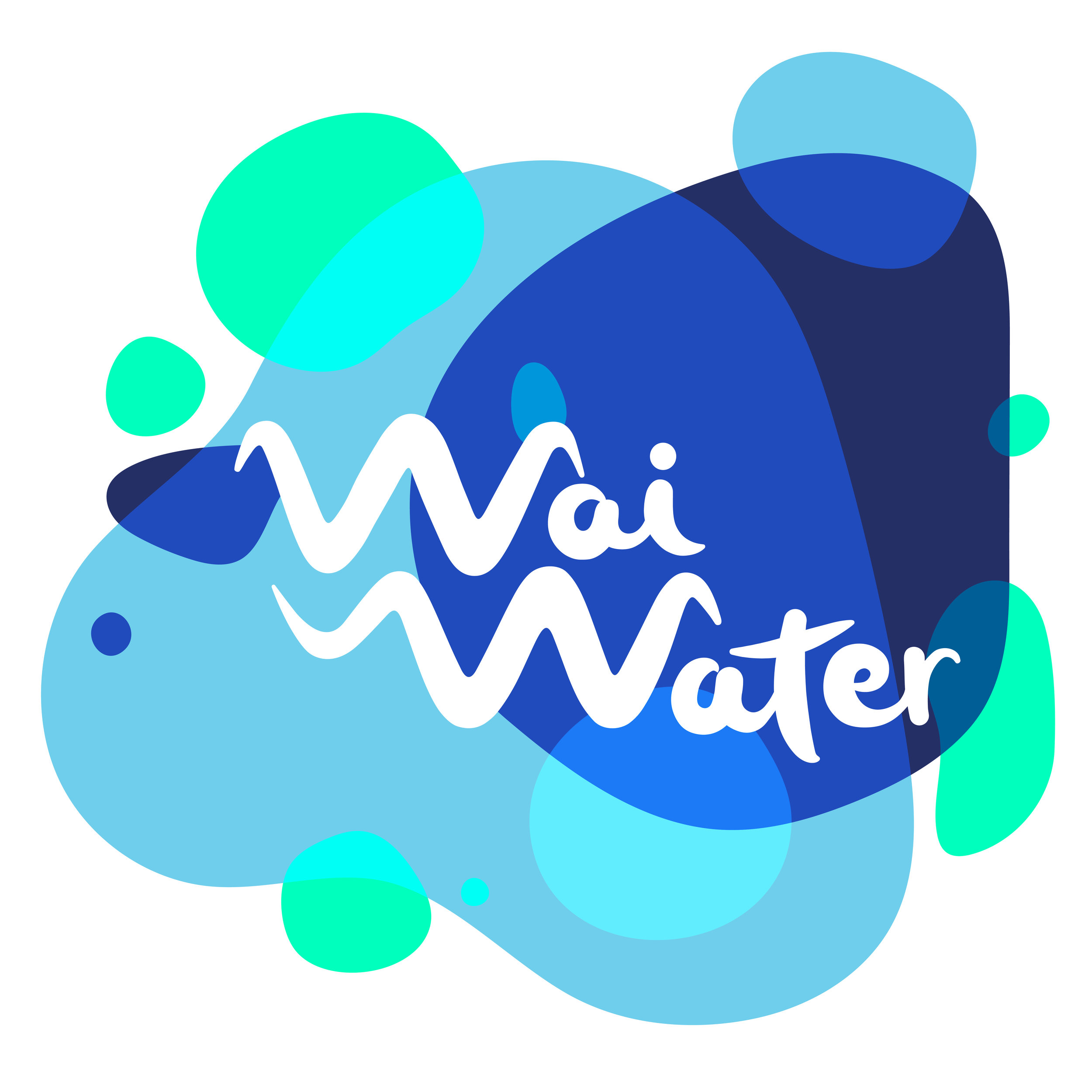
Healthy Futures needed a bright, fun, clean logo for their campaign, Wai Water. "The Wai Water Mission: To reinstate Wai as the drink choice for New Zealanders." This programme supports communities to rethink and replace sugary drinks - turning their backs on the preventable diseases associated with sugary drinks. The goal of this identity design was to embrace the fresh and pureness of water, while still feeling playful and fresh.
The concept for this branding for Wai Water was to create a logo that embraced the fluidity of water. The resulting design became a typography based logo that sits on flowing blue shapes that can be flexible in shape and size, making a small logo or wrapping around to fit on a pamphlet, poster or waterbottle.


