Apercure Visual Identity

CLIENT : Apercure
CATEGORY : Identity Design / Branding
DATE : 2021
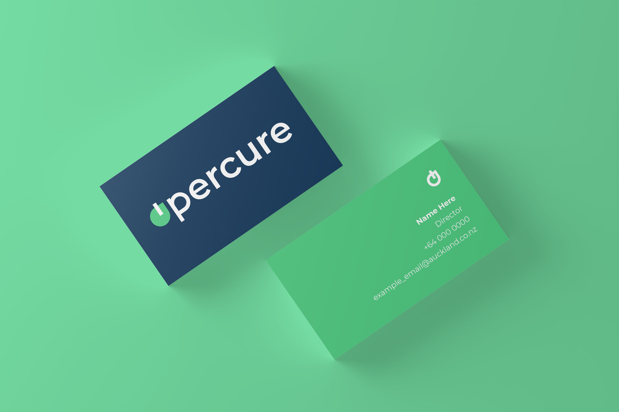
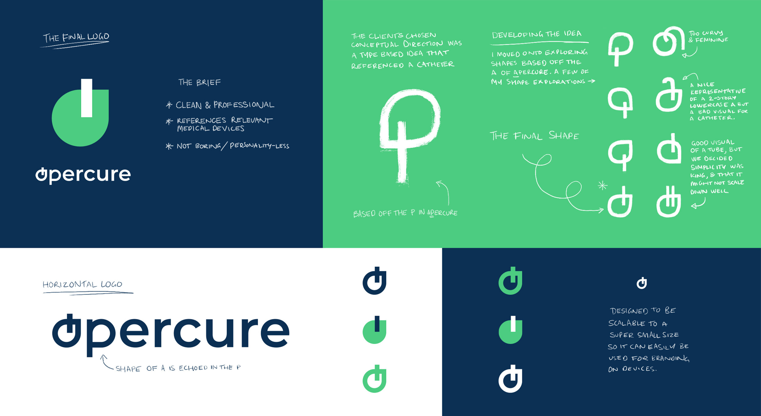
A small, innovative medical device design studio, Apercure needed a clean and simple but still striking visual identity. They wanted it to feel professional and convey efficiency while still suggesting a smaller company with personality and creativity. Having a hint of medical/surgical connotations was also a strong desire of the Apercure team.
I worked with them to create this strong but simple brand identity. The design was typographically based, but also references the shape of a catheter entering the skin. They are able to use the brand mark and their colours with some flexibility, giving their visual output a strong brand look and a sense of character. We wanted the brand colours to feel fresh but still professional and not be too strong to distract from their content, or too loud to use in a medical context.